 InRoom Wall ArtUser manual · dashboard
From installed to selling, screen by screen.
The app carries its own guided tutorial: a button on every screen that points at the controls one by one and changes with your situation. This manual is that same walkthrough —eight screens, eighty-four steps— written down.
inroom.es
Every screen has a button that says «Tutorial»
Bottom right, always. And it isn't generic help: it points at the controls one by one on whichever screen you're on, and it changes with your situation — it doesn't tell you the same thing if you've already published as if you still have frames to link. There are eight walkthroughs and eighty-four steps in total.
This manual is that same walkthrough written down, to read in one go, print, or search for something specific. If you're sitting in front of the dashboard, use the button; if you're getting ready before installing, keep reading.
1
2
3
Saving is not publishing
Saving keeps your work safe inside the dashboard. Publishing is what sends the changes to your shop. The AR always reads what's published, never what you've only saved. If you've configured something and your customer can't see it, start here.
A frame reaches the AR only if three things are true at once: the app knows which variant option is the frame, the frame is switched on and linked to a value of that option, and you have pressed publish. None of the three warns you on its own.
And some features depend on your plan: the Composer and the Wall Studio come with Studio; the Hypercatalogue, with Enterprise. If something looks locked, it isn't broken.
The app knows which of your variant options is the frame. It usually recognises it by name on its own.
The frame has its switch on and is tied to a specific value of that option.
You've pressed publish. Saving doesn't reach the shop: the AR always reads what's published.
All three have to be true at the same time and none of them warns you on its own. If your customer can't see the frame, walk these three before anything else: in practice that's where the fault is nine times out of ten.
01Artworks — the main switch
It's the home screen and where you decide which pieces have AR.
The master switch
Turn it on and the AR button appears in your shop. Off, nothing shows even if everything else is configured.
All pieces at once
If your plan allows it, one switch turns AR on across the whole catalogue. If not, you pick them one by one from the grid, with a search box and bulk selection.
Your count
How many pieces you have with AR and, if your plan has a cap, how many you have left. On the free plan it's three.
Save
Nothing reaches your shop until you press save.
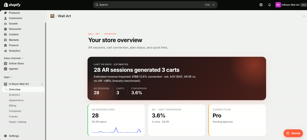
At the top you have your numbers: how many times customers have opened the AR. If nobody has come in yet, that's where it'll show.
And right at the bottom, the shortcuts to your metrics and your plan, which are the two places you go after this screen.
02Frames — the screen most often left half-done
It's the biggest screen in the app and where nearly everyone gets stuck. The good news is that the screen itself tells you what's missing: there's nothing to guess.
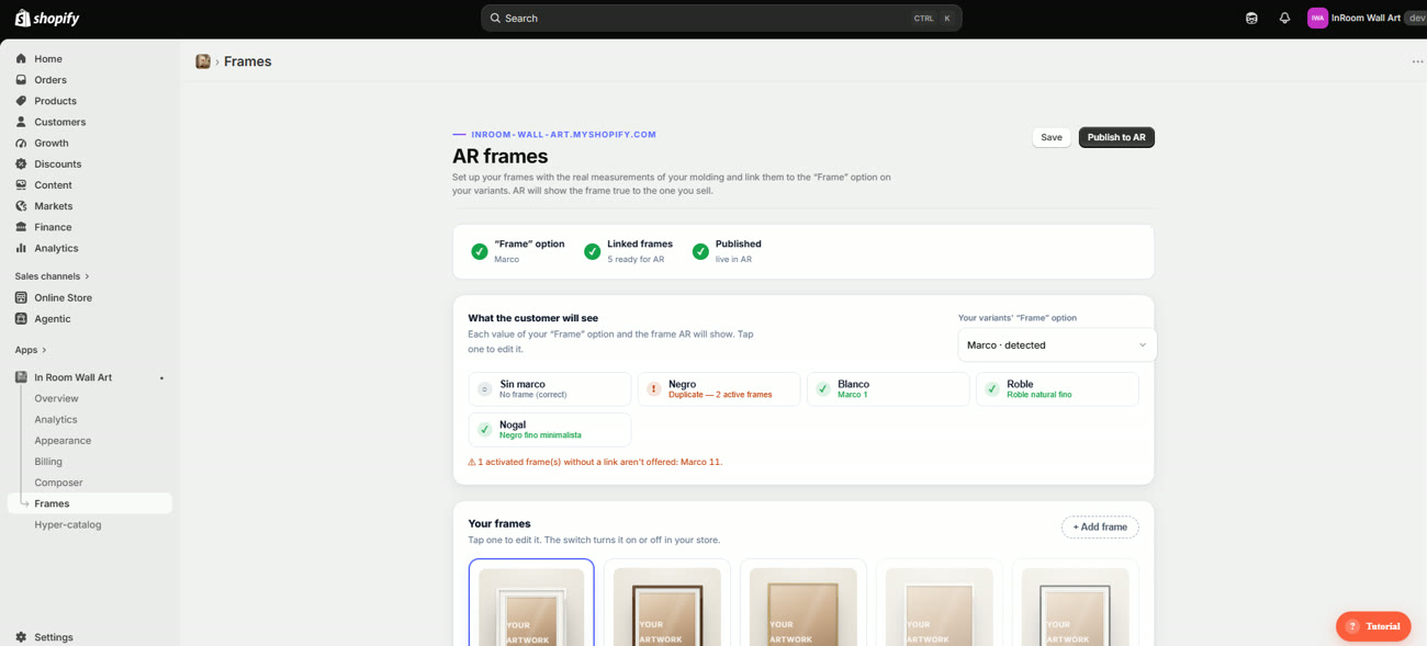
The readiness bar
The first thing you see, right at the top. It's the three conditions from the rule, each with its state. Until all three are green, your customer sees no frames.
 1
2
3
4
1
2
3
4
The value map: the four states
Each «what the customer will see» card has a state, and it pays to read them because this is where faults surface before a shopper hits them:
| State | What it means | What to do |
|---|---|---|
| Green with a frame name | That value has its frame linked and will show in the AR | Nothing. But read the name: this is where crossed links get caught |
| Grey «no frame (correct)» | The «No frame» value doesn't need one. It's fine as it is | Nothing |
| Amber «duplicate» | Two active frames are fighting over the same value. The app doesn't know which to show | Switch one of the two off, or change its link |
| Bare | That value sells and has no frame assigned: the AR has nothing to show | Create the frame and link it, or stop selling that value |
Read the names on the map, one by one, before publishing. In the screenshot above, the value «Nogal» (walnut) points to a frame called «Negro fino minimalista» (slim minimalist black). It's green — technically correct, there is a link — but it's almost certainly a crossed wire: whoever set it up linked the wrong one. The readiness bar cannot detect this; only you know which frame goes with which value.
The frame editor
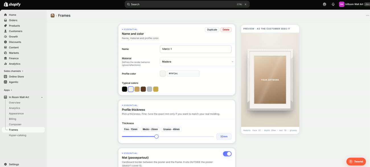
Press a frame in the gallery and it opens underneath. On the right you get the preview as the customer sees it, redrawn on every adjustment — if it looks wrong there, it'll look wrong in the AR.
 1
2
3
4
1
2
3
4
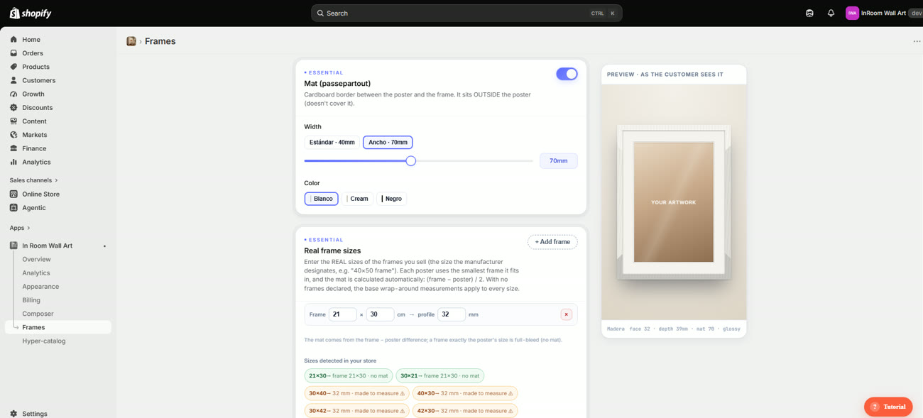
wood · face 32 · depth 39mm · mat 70 · glossy. That's exactly what gets sent to the AR.The mat and the real sizes
Here is the most confusing part of the whole app, and it's worth reading slowly because it behaves differently depending on how you set it up.
The mat is the cardboard between the poster and the moulding. One detail the screen itself underlines: it sits outside the poster, it doesn't cover it. So a 30 × 40 poster with a mat doesn't look smaller: the frame gets bigger.
 1
2
3
1
2
3
The mat works itself out: (frame − poster) ÷ 2
If you declare the real sizes of your frames, each poster goes into the smallest frame it fits in and the mat comes from the difference. A 30 × 40 poster in a 40 × 50 frame leaves 5 cm of cardboard on each side, and that's what the AR draws.
If you declare no sizes at all, the base width you set above applies to every size equally. And a frame exactly the poster's size comes out full-bleed, with no mat.
Right at the bottom, the sizes detected in your shop. The app reads your variants and tells you what happens to each one:
| What you see | What it means |
|---|---|
| In green «21×30 → frame 21×30 · no mat» | That size fits a frame you have declared. It knows exactly what to show |
| In amber «30×40 → 32 mm · made to measure» | No declared frame fits it, so it falls back to the base profile. It works, but it is an approximation: if you really sell that size, declare its frame |
This block is, by some distance, the best diagnostic tool in the app. If you sell in six sizes and four come out amber, you know exactly what is missing and how approximate what your customer sees really is.
Advanced settings
Folded away on purpose: open it only if you need it. Three things live in there: the acrylic, which puts the glass in front and decides whether it reflects or stays matte; the depth, which is what casts the shadow on the wall in the AR; and the source of the measurements, in case you print with a particular supplier and would rather start from their sizes than the generic ones.
And publish
The button is called «Publish to AR», not just «publish», and it is worded that way on purpose: it is what sends the frames to the viewer. Only the ones switched on and linked travel. Saving keeps your work safe inside the dashboard, but what your customer sees does not change until you publish.
The order that saves you grief: create the frame → set its millimetres → link it to a value → watch the map turn green → read the names → declare your real sizes → check no sizes are left amber → publish. Skip the second-to-last step and the AR works, but it shows approximate frames.
03Appearance — how it looks in your shop
Here you dress the elements your buyer sees. Nothing here changes how the AR works: it changes how it's offered.
Check what you're dressing
The element is picked at the top. Each one —icon, tab, button, catalogue button, modal and QR— has its own look and is saved separately. Changing the button doesn't touch the tab.
Start from a style
There are twenty ready-made styles. Take one and adjust it, rather than starting from scratch. The categories only filter the grid: they change nothing in your design.
Fine-tune by tabs
Each tab holds one kind of setting: colours, borders and shadow; typography; icon; size and margins; animation; and the words your customer reads.
Two of them have their own panel
The icon has a separate panel with its shape, colour and size. And the QR has its own styles and its own preview, apart from the buttons, because there what matters is that the code still scans.
If you've made a mess, go back
Once you tweak things by hand, a button appears that returns that element to the style you started from. You don't lose the rest: only that element.
Check it on mobile
Most AR comes in from phones, so look there too. The preview updates as you type, without saving.
Save and publish
Saving keeps the draft safe and you can carry on tomorrow. Until you publish, your customers see what was there before.
Say what they get, not what it does. «See it on your wall» works better than «Launch AR». And the second line is for removing the doubt that stops the purchase: something like «check the scale before you buy».
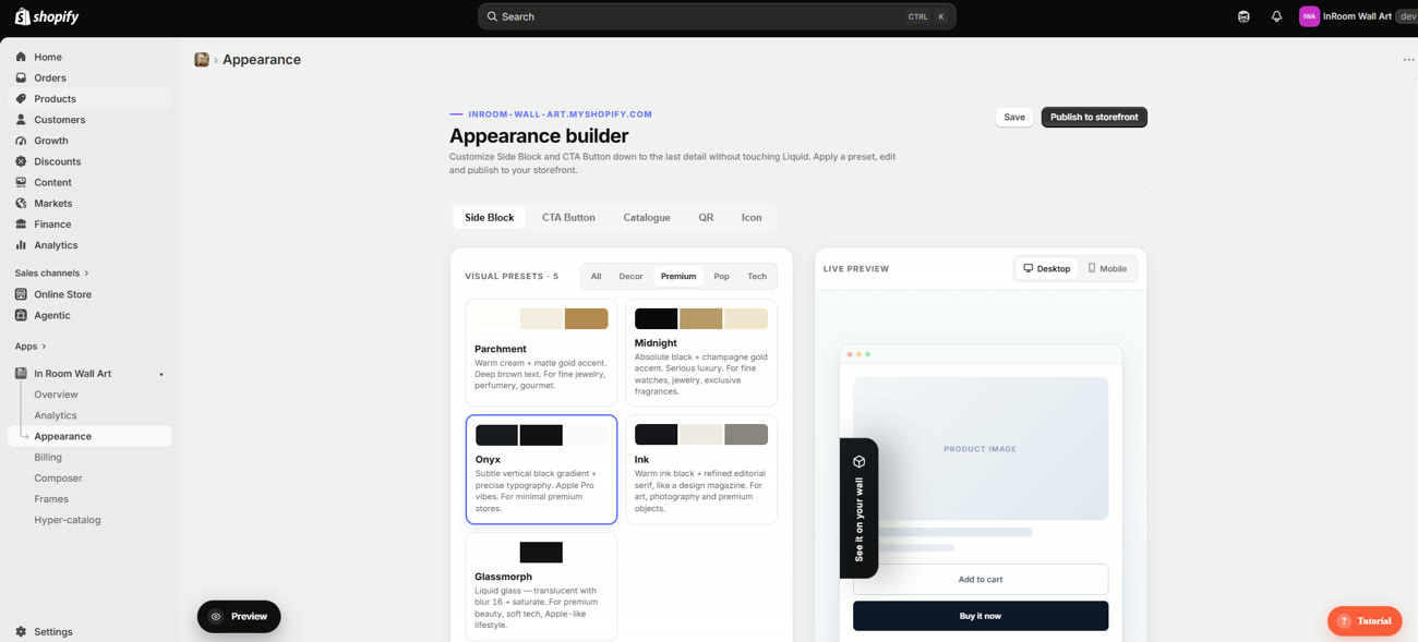
The styles come labelled by sector —Decor, Premium, Pop, Tech— and each one explains which kind of shop it's for. «Midnight: absolute black plus champagne gold, for watches, jewellery and fragrances». It isn't a loose palette: it's a recommendation.
The seven tabs
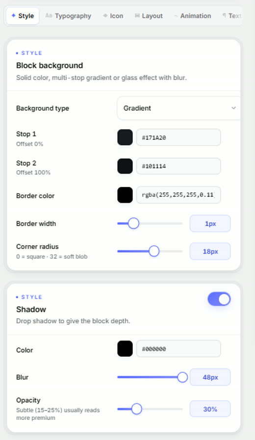
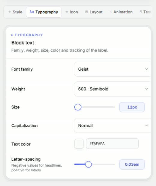
Once you've picked a style, you fine-tune control by control. The Side Block, the CTA Button and the Icon share exactly the same set of tabs, so what you learn on one applies to all three.
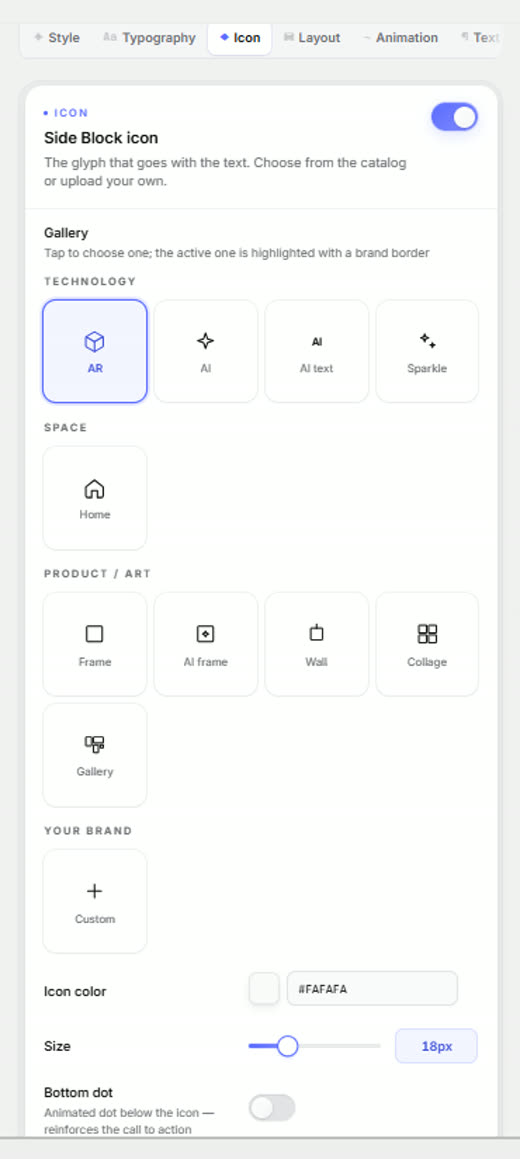
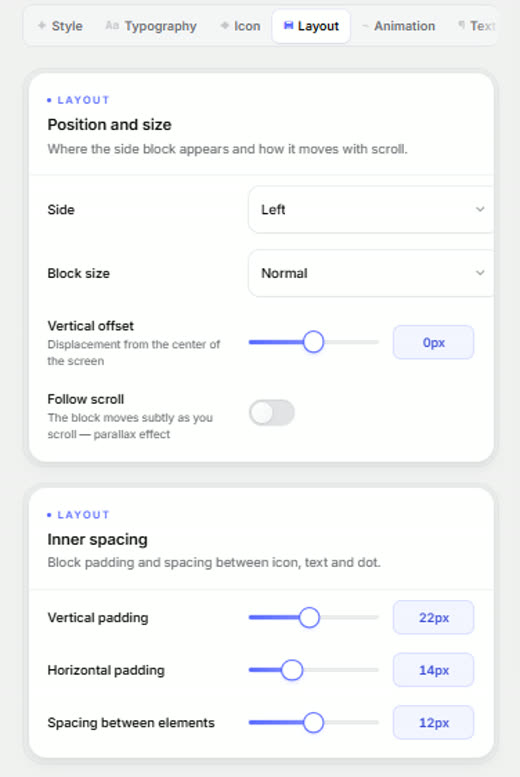
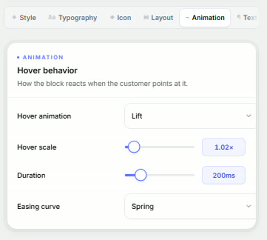
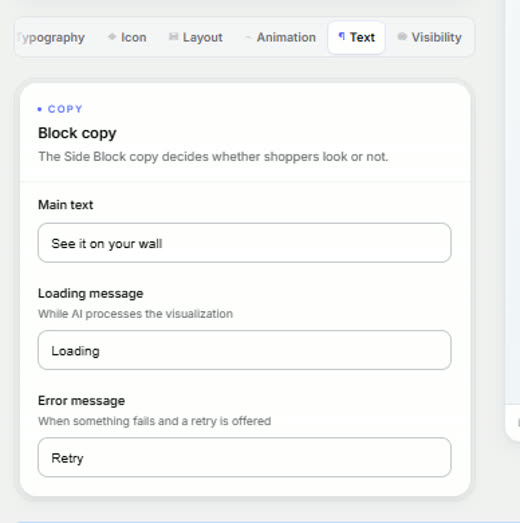
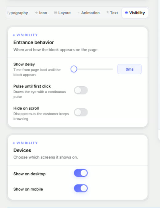
| Tab | What's inside |
|---|---|
| Style | Solid background, a two-stop gradient or a glass effect with blur. Border colour and width, and a corner radius from 0 to 32, square to capsule. Shadow on its own, with colour, blur and opacity — and the advice right there: 15 to 25 % usually reads more premium |
| Typography | Family, weight, size, caps or normal, colour and letter-spacing. With the hint on when to go negative and when positive |
| Icon | A gallery by category —technology, space, product and art— or upload your own. Colour, size, and an animated dot underneath that reinforces the call to action |
| Layout | Side, size, vertical offset from the centre of the screen, and a parallax effect on scroll. Plus the three inner paddings |
| Animation | How it reacts on hover: lift, scale, duration and easing curve |
| Copy | The main text, the loading message and the error message. Three fields that decide whether the shopper looks or not |
| Visibility | Entrance delay, pulse until the first click, hiding as they keep browsing, and which screens it shows on |
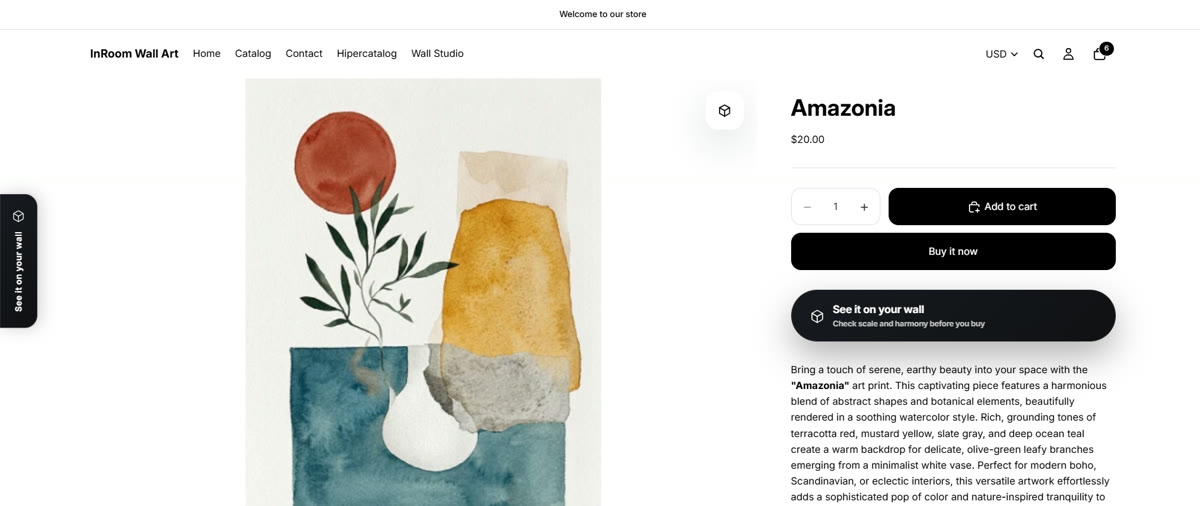
The three elements on the product page
This is what your buyer sees when they open a product. All three are switched on as theme blocks —none of them touches the code— and all three are dressed from this same screen.
 1
2
3
1
2
3
The catalogue button
Everything so far happens inside the product page. But there's a fourth element that lives outside it: a button over every thumbnail in the catalogue. It's configured in Appearance like the others and has its own tab.
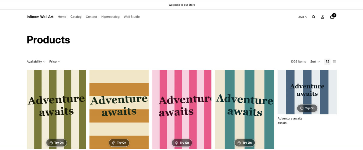
Without leaving the catalogue: they scan it and the AR starts on their phone.
It doesn't go through the product page. From the listing to the wall, in one tap.
Collection, search, home and product page. Each one switches on or off separately.
It sits over the photo or below it, in the corner you choose, with its margin, and it can appear only on hover. It comes with seven styles built to sit on top of an image —black pill, dark glass, light glass, white chip, outline, ink and accent— different from the CTA's twenty because the problem here is another one: reading over any photo without covering the artwork. From there you fine-tune control by control, like the rest.
The button shows on pieces that have AR switched on, so on the free plan you'll only see it on three. For it to appear across the whole catalogue you need a plan without a cap: Artist, paying per piece, or Pro at $19 a month, which is flat and unlimited.
04Composer — the arrangement studio
Comes with the Studio plan and up. And having it on your plan isn't enough: you have to place the block in your theme, which is often confused. They are two different spots: the block on the product page, and the menu link that opens the full Wall Studio. It's detailed in section 08.
Switch it on
A master switch. Turning it off loses nothing you've configured.
Decide which pieces go in
Where the pieces your customer can combine come from: picked by hand, by collection, or everything except whatever carries a given tag.
Configure the five steps
Banner content, layout, skin, palette and wall. The skin brings colour and typography together: it's the shortcut to matching your shop. The palette changes only the colour without touching the typography.
Choose the wall
The background your customer hangs the pieces on. A photo of a real wall usually sells better than a flat colour — and if you tell it how tall the wall is, the pieces come out at true scale.
Set the maximum
How many pieces your customer can combine in one arrangement.
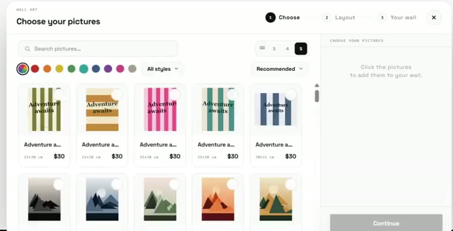
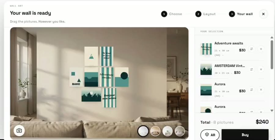
The Wall Studio
On desktop, the same #composer link opens the Wall Studio: the full-screen studio. The state lives in centimetres — it stores each piece's centre on the plane of the wall, and the screen only applies a px/cm factor. That's why the measurements are real and not a decorative label. On mobile it opens the touch canvas instead.
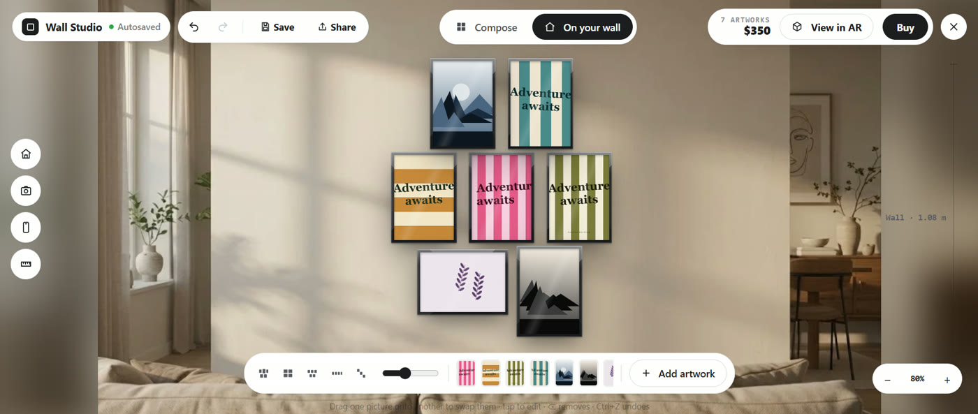
Two modes, which is the segmented control in the middle. Compose works on a neutral background with no wall: the arrangement sits inside a dotted box whose measurements are those of the set, not the wall. On your wall puts that same arrangement, at the same scale, on a wall with its real measurement.
| Where | What it does |
|---|---|
| Bottom dock | Layout presets (press the same one again for another variant), the spacing slider —the real gap in centimetres between frames, typically 5-8 in a gallery hang— the thumbnails of what's hung, and «Add artwork», which opens the catalogue with search by title, by size («50x70») or filtered by colour |
| Left rail, «on your wall» only | Room: sample living rooms and sideboards, each with its wall already measured. Photo of my wall: upload the actual gap. From my phone: on desktop it gives a QR — scan, shoot, and the photo lands in the studio by itself. Measure: mark two points on something known (a door width, a skirting board) and say how long it is |
| Shortcuts | Drag one piece onto another to swap them, tap to edit the frame, Del removes, Ctrl+Z undoes. Zoom with Ctrl and the wheel |
| Top bar | Autosaves while they work and restores it when they return. Share creates a link with the wall assembled: whoever opens it sees the same thing and can buy it. Buy takes every piece with its size and its frame, and the arrangement travels with the order |
05Hypercatalogue
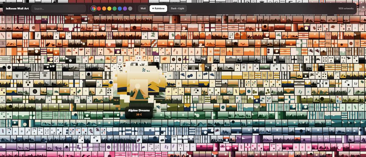
Comes with the Enterprise plan. You choose how your catalogue is travelled through, switch it on, and —this is the bit most often forgotten— switching it on isn't enough: you have to link it from your theme's header with a link containing #hipercatalogo.
The status box reads what's saved, not what you're currently editing: it's there to confirm which mode your customer is seeing, which may not be the one selected on screen.
06Analytics
Available from the Pro plan. It has five readings, and it helps to know what to ask each one:
At the top there are four figures for the period you picked —AR views and carts among them— and below, a day-by-day chart where each point is one day: that's where you notice whether a campaign moved anything. If you've just installed and see nothing, that's normal: the numbers appear as soon as a customer opens the AR on one of your pieces.
| Block | What it answers |
|---|---|
| Funnel | Which step you're losing customers at |
| Conversion | How many of those who open the AR end up buying |
| When they look | Your busiest hours and days, useful for deciding when to post |
| Which piece pulls | Piece by piece: how often it's opened in AR and how often it sells |
| What now | InRoom reads the numbers above and tells you what it would do |
You can narrow the date range and export the data.
07Your plan and billing
All billing goes through Shopify: when you pick a plan, Shopify asks you to approve the charge. The app never charges anything on its own and doesn't store your card.
You pay for slots, not for pieces
You set the quota of slots you want to pay for, and then you decide which piece sits in each one. Changing which piece occupies a slot costs nothing: you can rotate the seasonal collection every week without paying extra. What you can't do is drop below the number of slots you're already using.
Raising the quota
The difference is charged there and then, not next month.
Lowering it
Nothing is refunded and the change takes effect in the next cycle. If you already have a reduction scheduled, this cycle's quota stays live until it ends.
Monthly or annual
The toggle changes the prices below. Annual gives you two months free, already discounted in what you see.
Cancelling
It doesn't cut you off today: you keep access until the end of the period and then return to Free.
At the top there are four figures with your plan at a glance. They're exactly the ones we'd ask you about in a ticket, so if you write in about a billing problem, start there.
The notices you might run into
This screen changes with your situation. If you get one of these, nothing is broken:
| What you see | What it means |
|---|---|
| «Not in your plan yet» | You asked for a feature your plan doesn't include. It tells you which one brings it, and you can pick it right there |
| «You're on trial» | You have the full plan at no charge. When it ends you're billed, unless you cancel first |
| Trial ended | You're back on Free until you choose a plan, with its piece cap and the mark visible |
| Charge pending | The plan doesn't activate until you approve the charge on Shopify's screen. It's the silliest failure of all: you pick a plan, close the tab and never approve it |
| Switch suggestion | With your current slots, the flat plan works out the same or better. It's a suggestion, not a charge |
| Free cap | You've hit three pieces. To put AR on more, you need a plan |
08Installing it in your theme
This is where people get stuck most, because it doesn't happen in the app's dashboard but in Online Store → Themes → Customize. Three steps, in this order, and none of them is optional.
The engine. Switched on once and it covers the whole shop.
The icon, the button and the side tab, on the product template.
Wall Studio and Hypercatalogue. This is the one almost nobody does.
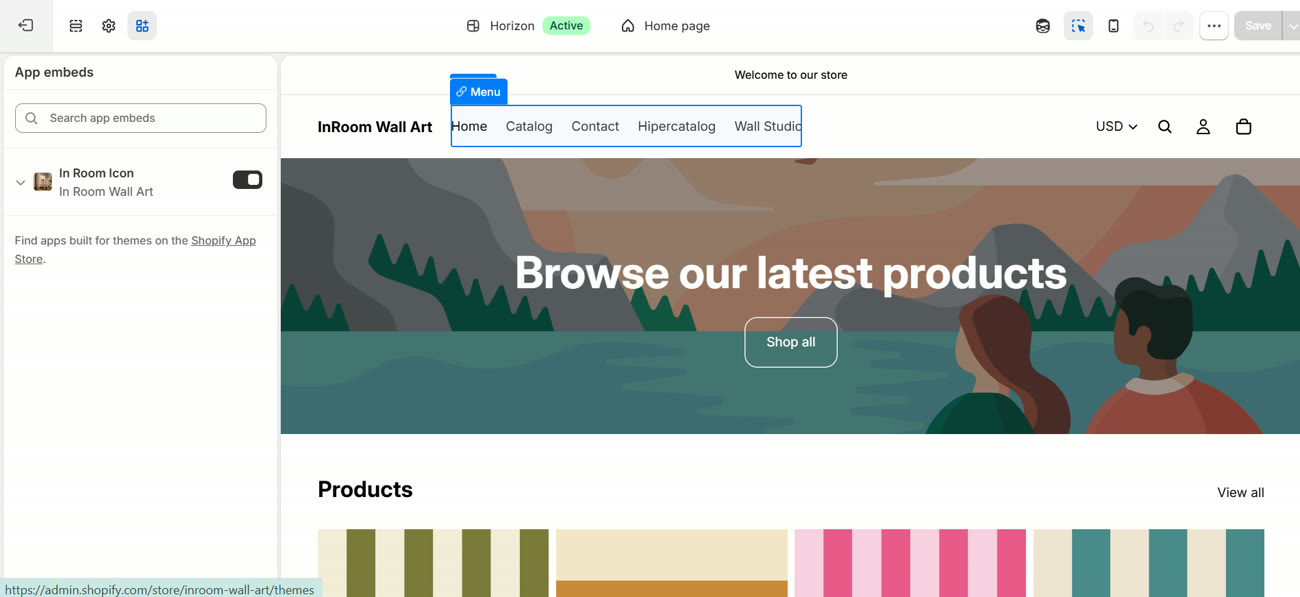
Step 1 · Switch on the app embed
In the theme editor, top left, the App embeds icon. In Room Icon is in there with its toggle. It's the engine: without it nothing else works, however well the dashboard is set up.
 1
1
Step 2 · Put the blocks on the product page
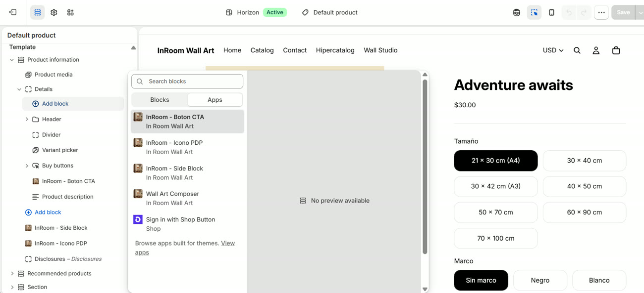
Switch to the product template and press Add block. In the dialog, the Apps tab: the four InRoom blocks are in there. Place them wherever you want inside the page by dragging.
 1
2
3
1
2
3
Step 3 · The Wall Studio and Hypercatalogue links
This is the one almost nobody does, and without it the Wall Studio and the Hypercatalogue can't be opened even if you've configured and paid for them. They aren't blocks: they hook in through a menu link.
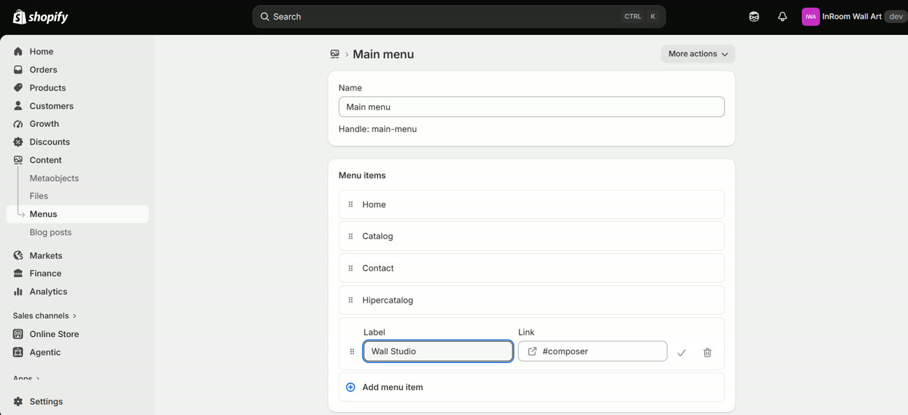
Go to Content → Menus → Main menu, press «Add menu item» and fill in two fields:
 1
2
1
2
| To open | Type in the link | What happens on click |
|---|---|---|
| Wall Studio | #composer | On desktop it opens the full-screen studio. On mobile it opens the touch canvas |
| Hypercatalogue | #hipercatalogo | Opens the navigable catalogue, in whichever mode you have saved in the dashboard |
The Composer block and the Wall Studio link are not the same thing. The «Wall Art Composer» block from step 2 is the banner that appears inside the product page. The #composer menu link opens the full-screen studio. You can have one without the other, and that's exactly what happens to almost everyone the first time.
Shopify allows several product templates. If you added the block to the «Default product» template but the product you're looking at uses another one, it won't show. Check it on the product page, right-hand column, «Template» field.
The catalogue button is deliberately in none of the three steps: it isn't a theme block or a link. You switch it on from Appearance and it places itself over the thumbnails.
09When something doesn't show
Ordered by how often it actually happens. The first four cover nearly everything:
| Symptom | Usual cause |
|---|---|
| I set up the frame and it doesn't show | It was saved but not published. The AR reads what's published |
| It shows with no frame | The frame exists but isn't linked to a variant value |
| One value comes out bare | That variant value has no frame assigned to it |
| A value is flagged as duplicate | Two active frames are linked to the same value. Switch one off |
| The frame comes out the wrong thickness | That size has no declared frame and fell back to the base profile: it shows «made to measure». Declare its real size |
| It shows the wrong frame | A crossed link. The readiness bar cannot detect it: you have to read the names on the value map |
| The button doesn't appear | The In Room Icon embed isn't switched on, or the block is on a different product template |
| The size is wrong | Check the variant's measurements and the profile thickness |
| AR won't open from Instagram | Its in-app browsers don't allow it. The app detects this and guides the customer to Safari |
| The Composer does nothing | Either the plan doesn't include it, or the block is missing from the theme |
| The QR leads to a password | Your shop is in password mode, under Preferences |
10The recommended order
If you're starting from zero, this is the short path:
- Install the app and pick a plan (or stay on Free to try it).
- In Themes → Customize: switch on the In Room Icon embed and add the blocks you want to the product page.
- In Frames: pick the variant option, create your frames with their millimetres, switch them on, link them and publish.
- In Artworks: turn on the master switch and enable AR on your pieces. Save.
- In Appearance: pick a style, check it on mobile and publish.
- Open it on a real iPhone and check size, frame and payment.
With that you're already selling. The Composer, the Wall Studio and the Hypercatalogue come afterwards, once the AR is working.
Every screen has its guided tutorial. And under Support there are three things: a button that opens your email with the subject filled in and your shop inside it, a resources section with the documentation, and a diagnostic report you copy and paste into the message — it's half the questions we'd ask you, already answered. Write to hello.inroom.app@gmail.com with your shop's name and the theme you use: the person who wrote the code answers.
If something won't work, write.
Tell me your shop's name and the theme you use. The person who wrote the code answers, not a first line of support. If you'd rather, I'll set it up for you with collaborator access.
inroom.es
Ian Otero · Sabadell